6 Essential Elements of a Brand Identity
Your brand identity is essential to your business’s success, but not just any brand identity will do. You need a cohesive brand, that covers all of your bases and keeps your name intact. The more settings and locations that you use your brand in, the more dynamic and robust your brand identity will have to be, or you’re going to find yourself asking tough questions and looking chaotic.
When first starting a brand, a lot of companies create their logo and then think they’re good. Then, they have to put their logo on a dark background and find that they have to make some changes. They can’t use their decorative font for all of their headers, so what do they use instead? They need to put imagery here, but for some reason, it just doesn’t look right next to that logo. The list goes on and on.
Preparing for all of these scenarios can be difficult if you don’t know the right questions to ask, or if you aren’t sure of what sort of challenges your branding will end up facing. However, starting with the essentials will put you on the right path.

1. Your Logo or Wordmark
Logos are always the start of it all. It is the foundation and core of your brand and is often the first thing potential customers will see that represents you as a company. But there are a lot of options, and it can be difficult to determine which type of logo is right for you.
Whether you chose to go with a symbol, a wordmark (a logo made almost entirely of text), or a combination of the two, is entirely up to you. Some industries may lean towards one option or the other, but there are no hard rules when it comes to creating your logo.
2. Logo Variations
It doesn’t matter how great your logo looks, there will one day be a situation where it just won’t work. Whether it’s too dark or too light, or perhaps has to be printed in black and white, logo variations are a must for any brand identity.
Common variations rely on the lightness of a logo, as mentioned before. If you have very light colors and need to place the logo on a similarly bright surface, the logo will fade away and be missed, which no one wants. Having lighter and darker variations of your logo can help prepare you for these situations.
Likewise, there are often times where the composition of your logo may need to change. If your logo is relatively square, it will also need a long and flat variation, for when the space that your logo is occupying fits that criteria instead.
3. Colors
Colors are a complicated science, and you must be sure not to underestimate their importance. Your brand will obviously have its key colors, typically the ones utilized in the logo. However, there will be times where you will have to break away from these standards and do something different.
Having preferred color palettes to use for more detailed settings will be key in keeping your brand cohesive. And the more detailed you get, the better. These color palettes can be complementary and supportive of your key colors or can be special branches that are separate from your key colors that are used in specific situations. These separate palettes are often seen during the holidays when one has to match the common themes of the holiday while still keeping their brand cohesive.

4. Fonts and Typefaces
Fonts and typefaces are often some of the most overlooked elements of a brand identity, but they can be incredibly crucial to keeping your look cohesive. Your typography will inform your viewers of your personality and mood, in many cases without them even realizing it. Yet there are many situations where the fonts that you use are restricted in some way. So how do you maintain cohesion?
Creating a list of preferred fonts will be a major boon for a comprehensive brand identity, typically starting with whatever fonts were used in the logo. The more robust this list is, the better. Having well known and popular fonts will also make it easier for these fonts to be available no matter the situation.
It is also a good idea to pinpoint the purpose of each font, and what aspects are key. This means that if a font isn’t available, it can be replaced with minimal damage. Focus on aspects such as legibility, use of serifs, and line weight.
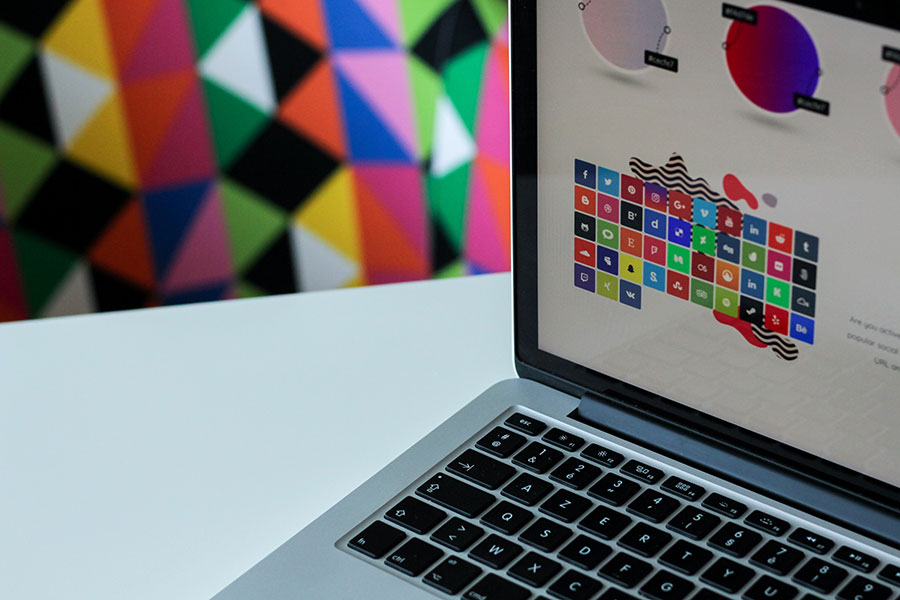
5. Image Style
Often times, when a single designer is creating all of your content, it is relatively easy to keep a consistent style throughout all of your imagery and graphic elements. However, the more designers you add, the easier it is for that style and aesthetic to shift and warp, becoming more chaotic with each new hand. Laying out exact features and aesthetics can help mitigate this.
Being clear about what imagery you want to be used in your brand is very important when using multiple or contract designers. Details such as clarity, aesthetic, theme, and photography style can be crucial to keeping your brand consistent.
6. Graphic Elements
Finally, we have your graphic elements. This element encompasses many loose aspects of your brand, including things like button styles, icons, layouts, and more. Because this branch of design is so varied and all-encompassing, it is very easy for it to be forgotten when it comes to deciding and developing your brand identity.
However, it is here that chaos and bad branding often comes into play. Because elements are often forgotten in the early phases, it’s easy to find yourself spit-balling when it comes to the actual design process. Worse, it becomes easy to forget what you’ve done in the past.

Final thoughts
In many cases, the longer your brand operates, the more robust and developed it will become. The more situations you find yourself in, the more standard solutions you will have at your disposal. The key is to remember these solutions as you make them, and keep track of and document your brand identity often. Keep all of the elements of a brand identity together and you will set yourself up for success.